This holiday season has not been the super productive time that I had hoped. But then again, this is my vacation and other things need to get done.
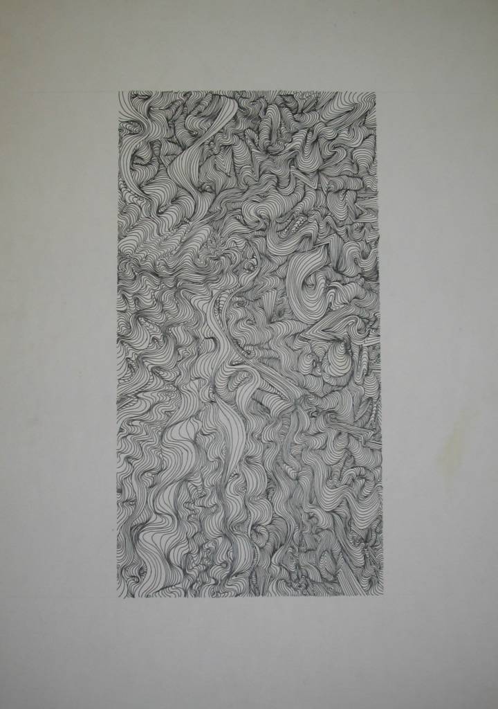
I thought that I would post some more commercial art projects. This was the final project of the year and would actually be put together at the beginning of the second year class (which I did not take). Therefore I never finished this project which is a shame. I had seen what the final project looked liked from other students, and it is much cooler than these pieces would indicate.
So, the concept: make an abstract cover that was suggestive of sea shells by using free-hand line work to form the illusion of peaks and valleys. This was actually much tougher than it looks. It took me a long time to get the hang of giving these lines depth and if it was not for the help of another student in class, I might never have finished (I heard through the grapevine that the student who helped me has gone on to a very productive career in art, and even worked on the first Shrek movie).
Tuesday, December 28, 2004
.jpg)
.jpg)
Saturday, December 18, 2004
Illustrations and Lettering
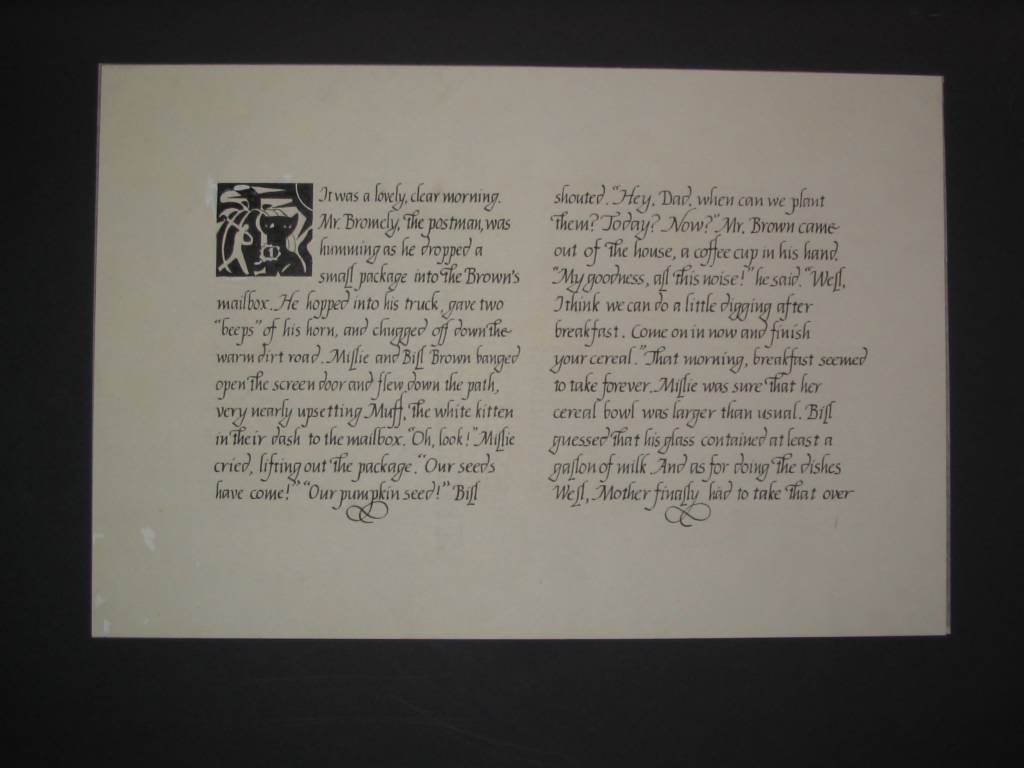
One of the neater projects in my high school commericial art class was doing a page from a children's book. We were supposed to choose a children's book (I chose one written by a friend of my mother). After reading the book, we were to pick out eight symbols/characters from the book and make a single symbolic illustration that would fit into a 2-inch by 2-inch square. Next, using calligraphy, we were to hand letter the first couple of paragraphs. The illustration is not one of my favorites, but I was quite satisfied with the lettering.
To make extra money in high school and during undergrad, I would do all sorts of hand lettering for people (i.e. wedding invitations, seating cards etc. . .). Now with computers, there really is not much cause for hand lettering.
To make extra money in high school and during undergrad, I would do all sorts of hand lettering for people (i.e. wedding invitations, seating cards etc. . .). Now with computers, there really is not much cause for hand lettering.
.jpg)
Tuesday, December 14, 2004
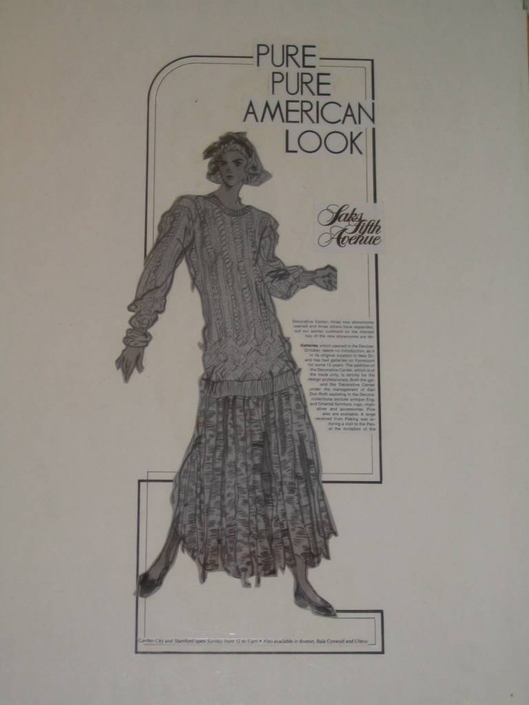
Fashion Figure Ad
As I mentioned in previous posts, I have unearthed my old high school portfolio. My high school had an intense commercial art program that did a great job of placing students at the School of Visual Arts, Parsons School of Design or FIT. The curriculum was tough, but it stretched me as an artist. Although I chose not to go to a NYC art school, opting instead to go to a regular university, I still remember these classes. Sometimes I wish I had become an artist or pursued my dream of being a cartoonist, but I did not want to live the cliché of a “starving artist” (wish someone would have informed about the cliché of a “starving graduate student”).
Before computers and their wonderful font programs, commercial artist had to do much of their lettering by hand, especially for ad layouts. The letters for my ad assignment were 3 inches tall and are shot down (forgot the name of the machine) to size. I hated hand letter. If you look closely, you can see the Dr. Martin’s Bleedbroof White, which I became quite proficient with over the years. Incidentally, I think the spilt ink in the corner lends the final personal touch.
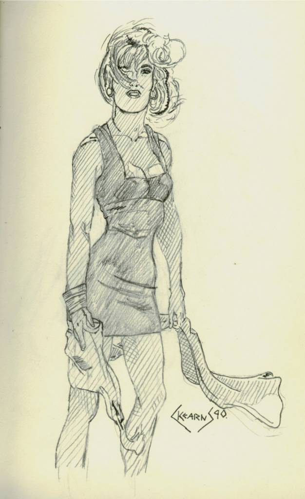
The fashion figure was painted entirely with a brush on 18-24 inch cold press paper. Of all my work in high school, I am most proud of this figure. I had never before used a brush to draw. The brush allows for incredible control in line thickness. Plus it is really cool. And yes, the figure does have a disproportionally long torso because this is the way they are supposed to look.


Sunday, December 12, 2004
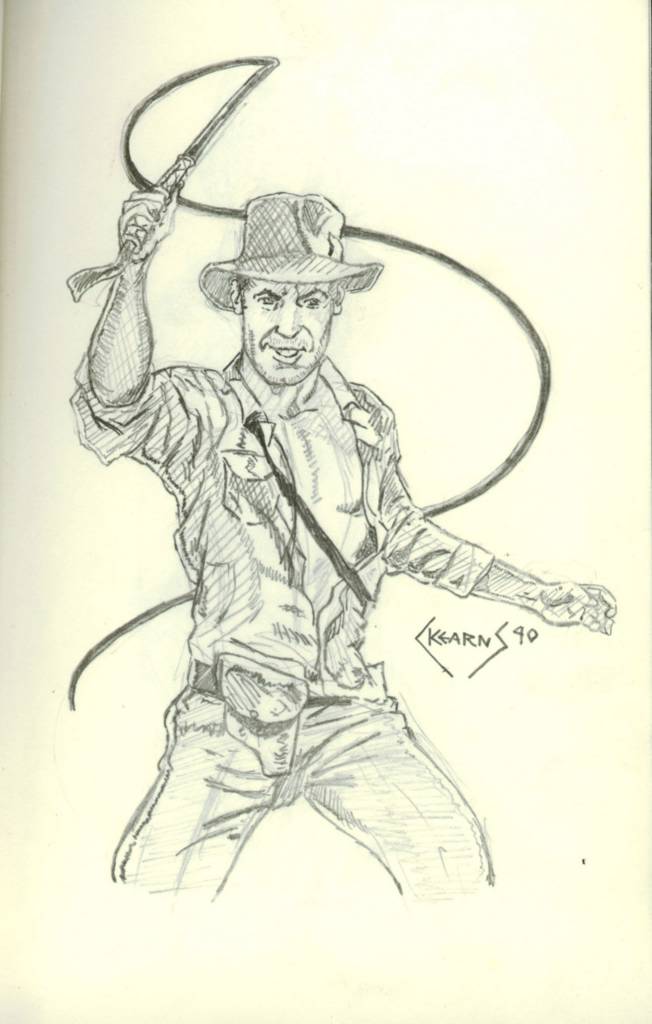
From the Mind of a 14 year old boy
Back in high school I took every art class available because all I wanted to be was a cartoonist. In one of my drawing or design classes we were asked to design a new lettering style. This was back in the mid-80's before computers and font packs, so much of professional lettering was still done by hand (more samples of this later). Me being the huge comic book geek that I was, I did something decidedly different. Drawing inspiration from the ninjas and Electra in Frank Miller's run on Daredevil, I designed "The Ninja Alphabet" or "Ninjalphabet" for short. I alternated between the black and white ninjas and tried to incorporate every weapon that I could remember. My favorites are the ones where the ninjas are injuring themselves (E, P, R) and I especially like Q and W, where the two ninjas are just hanging out. It was probably one of the more fun things that I ever got to do in school. I got to screw around and get an A, not too shabby.
More fun stuff from high school coming soon.
More fun stuff from high school coming soon.

Saturday, December 11, 2004
From the Archives
Those who braved the old website should already be familiar with my old pencil sketches and my desire to move everything from there to here. This use of heavy cross-hatch was my favorite style (compared to the minimalist style I am currently using). And for the longest while, the only real medium that I used was pencil, mostly the trusty ol' number 2 pencil (not just for taking scan trons) but sometimes I would use HB, 2H, 4H, 2B and 4B.
I just found my old portfolio locked in storage. I always wanted to digitize them, but at the time (late 80's), there were only very expensive options. Plus, they are far to big to scan now. The digital camera should work just fine. Look for them early next week.
I just found my old portfolio locked in storage. I always wanted to digitize them, but at the time (late 80's), there were only very expensive options. Plus, they are far to big to scan now. The digital camera should work just fine. Look for them early next week.
Wednesday, December 08, 2004
Not feeling the love. . .
Hmmm. . .Not feeling the love with this picture. It looks more like something you'd see in Veiwtiful Joe than what I was imagining. Not that this is necessarily a bad thing, but I had other hopes for this picture. Part of my issues, I guess, is that I was working with a limited palette of colors. I had planned on buying a bigger set of watercolor pencils, now my enthusiams is not as strong (but they really aren't that expensive, so I still might). I have not yet abandoned this technique just yet, but I am getting close.
So, what does everyone think about this multi-media technique?
So, what does everyone think about this multi-media technique?
%202.jpg)
Tuesday, November 30, 2004
Watercolor Pencils
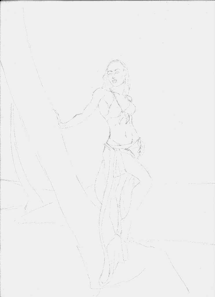
About ten years ago I was really in to using colored pencils over an inked drawing. So instead of using shading or cross-hatch to devolp depth, I would use colored pencils. This necessitated me radically changing how I drew pictures since heavy graphite pencil would interfer with the color pencil. I abandoned this style, mostly because I wanted to do larger pictures and it took too long fill in that much space with colored pencil. I think that this style should go well with water color pencils. At least that is my hope.
Since the style is very minimalistic and I am using a thin pencil (0.3 mm), this scan is very light. But I think it should convey the basics of the pictures. Obviously, the next step is to color it.
Since the style is very minimalistic and I am using a thin pencil (0.3 mm), this scan is very light. But I think it should convey the basics of the pictures. Obviously, the next step is to color it.
Saturday, November 27, 2004
Finall Color Blocking
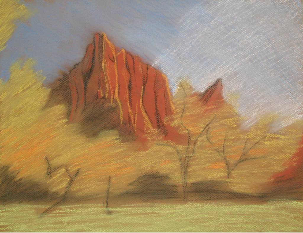
16x20, charcoal on Canson Mi-Teintes board
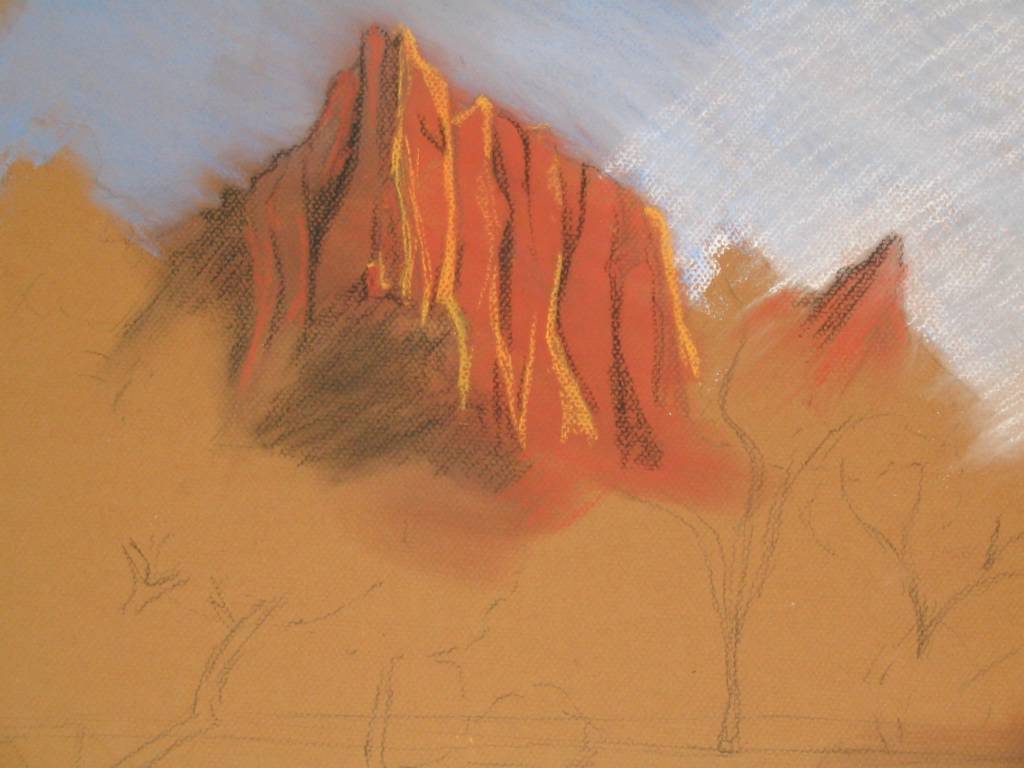
The initial part of the painting, or under-painting, is complete. Normally I do not put this much detail in the under-painting, but I wanted to see how the mountain would look. This is probably going to be a mistake since I plan to radically change the color scheme and I run the risk of people liking the under-painting more, which is likely, since at this stage it is closer to a drawing (my strength) and less like a painting (my goal). Only time will tell. But I am really excited about what I plan to do with the colors. As always, there is a vast gap between what is in my head and what makes it to the page.
For the next step I will work the painting hard using my old trusty Rembrant pastels (which are a medium soft pastel).

Monday, November 22, 2004
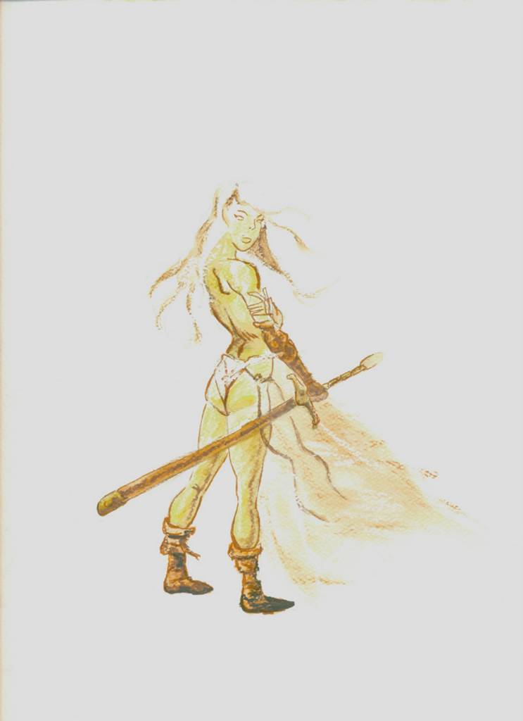
Bad Ass Fae
9x12, watercolor pencils with ink and pastel on paper
This is just me screwing around, plain and simple. I have been looking at the sketches over at sketchcrawl with envy over his skill in watercolor (not fair how cool those quick on locations sketches are!). I have always wanted to do stuff like that, but I really suck with watercolors (plus, they are so damn messy, at least in my hands). I had bought a set of watercolor pencils ages ago and decided to give them a try. Bolstered with ink pens and some pastels, I kinda like this effort. But at any rate, it sure was fun.
Tuesday, November 16, 2004
Monday, November 15, 2004
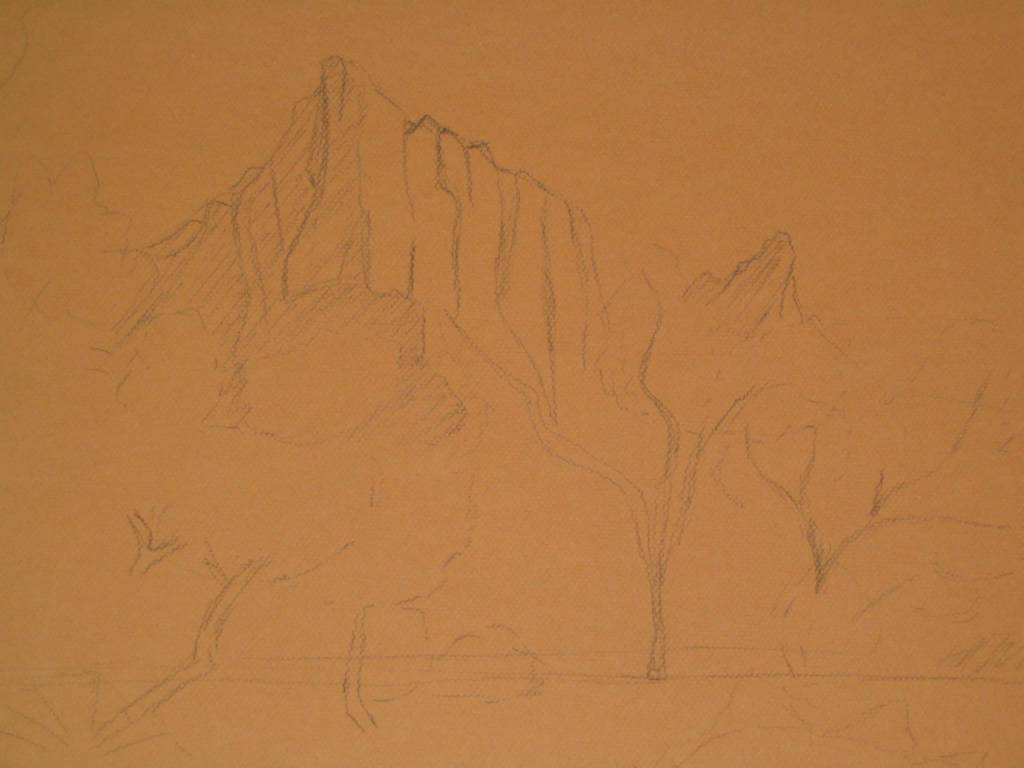
It all starts with a sketch. . .
Okay, Pman, you asked for it, you got it. More step by step postings. Part of my reasoning for doing this is to keep me motivated and keep me painting. I figure if I post the painting in stages and people keep asking me when I will finish, then I will try to be motivated to paint more often. At least that is the theory. Enjoy.
Most of my pastel paintings start with a charcoal under-drawing. Sometimes I will block in areas of dark, and sometimes (as is the case with this picture) I do not. The main area of focus of this painting will be the central mountain and it will contain the only significant dark area. The next step will be to begin to block in colors with a hard pastel (NuPastel). Hopefully sooner than later.
Most of my pastel paintings start with a charcoal under-drawing. Sometimes I will block in areas of dark, and sometimes (as is the case with this picture) I do not. The main area of focus of this painting will be the central mountain and it will contain the only significant dark area. The next step will be to begin to block in colors with a hard pastel (NuPastel). Hopefully sooner than later.
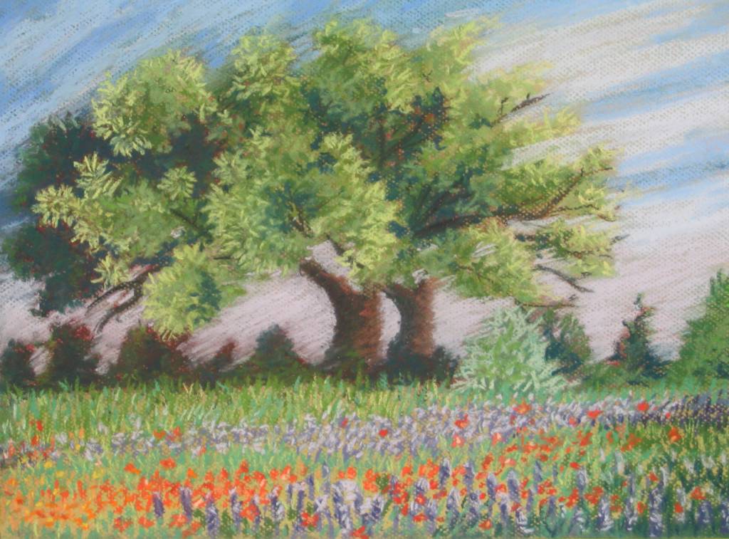
Summer by the Tree
12x16, pastel on Canson Mi-Teintes
I am sure most people will not see any difference between this version and the other version of this painting that I posted last week. But to me, there is a world of difference. Trust me, there is. I am glad that I made the changes but even happier that I did not ruin the painting in the process. This piece is, for all intents and purposes, finished. Not much more I want to say about it, so I guess that means I am done.
Friday, November 12, 2004
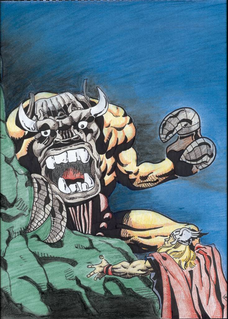
Kirby’s Thor
14x17, pastel with colored pencil and inks on bristol
Jack Kirby was a Genius. Even a watered down copy of his work looks cool. I was feeling down and out one day, wanted to draw something, but just did not know what to do. I picked up my beaten-up copy of an old Marvel Treasure Edition and decided to do the splash page from Thor #157 (from waaaay back in the day, the cover price was 12 cents). I always thought the Mangog was a cool-ass villain (obviously, the villain in this pic), seems that I am in the minority in this view. Oh well.
The figures are done in pen and ink with colored pencil. The background was quickly done in pastel. This picture was completed in about two hours and completely got me out of whatever malaise that I was in, but that was the point of this exercise.
Wednesday, November 10, 2004

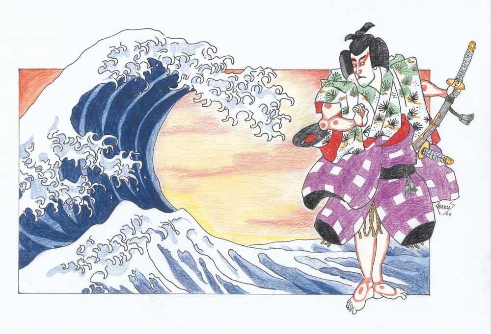
Ronin
14x17, pastel with colored pencil and inks on bristol
When I went to Japan for the first time and wanted to bring back gifts, I bought a bunch of tee shirts. These were two of the most common images that I found, Fujisan and a samurai. I called this piece Ronin as a play on words. Ronin, aside from being a masterless samurai, means “wave-person” since they were considered to be, literally, free as a wave. I thought myself quite clever by combing these two images.
Tuesday, November 09, 2004
HaloScan
I am hoping that by installing the HaloScan comment system that I have seen on other blogs should make adding comments easier. But as usual, I am confused as to whether it is working properly. Crap!! :(
Monday, November 08, 2004
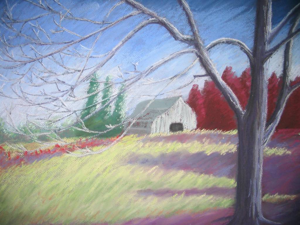
Summer by the Tree
It was not this summer and it was not this tree, but there was a summer and there was a tree...
I definitely liked the idea of posting pictures before they are completely finished, especially when many of my paintings need to "age" for a while before I feel they are completed. In this case, I am not sure if this is the finished product or if I will do some radical re-working in certain areas. I am leaning toward the latter and will probably spray it with workable fix and procede from there. In the interim, I have started another painting and will post pictures of it as it progresses.
I definitely liked the idea of posting pictures before they are completely finished, especially when many of my paintings need to "age" for a while before I feel they are completed. In this case, I am not sure if this is the finished product or if I will do some radical re-working in certain areas. I am leaning toward the latter and will probably spray it with workable fix and procede from there. In the interim, I have started another painting and will post pictures of it as it progresses.

Friday, October 29, 2004
Still Untitled
As I have mentioned before, one of the hardest parts of the painting process for me is naming the final piece. This one is still untitled even thought it has been matted and framed (another thing I hate doing is picking out a matte before framing). I had something for this that I thought I liked, but after thinking about it some more, I really did not like it. Mostly, my choice of a titled is fairly generic "Cheetah after the kill" or "Horst Study #1" but I would really like to be able to find a title that embodies the painting. So far, easier said than done.
So, anyone have any suggestions for this? Does it say anything to you? Comments and suggestions would be appreciated.
So, anyone have any suggestions for this? Does it say anything to you? Comments and suggestions would be appreciated.
Tuesday, October 26, 2004
Old Pencil Drawings
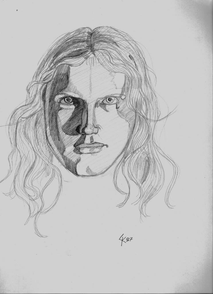
As I am waiting to finish my latest pastel painting (yes! two paintings in one month, I must be inspired!) I thought it might be cool to post some older pencil drawings. The first (Her Stare) was done when I was 17 while the second (Koriand'R vs. Komand'R) was done at the ripe ol' age of 12. Sometimes I look back at my older pencils from around that time and I think this was the height of my drawing ability. It is certainly the most prolific period (I have a box full of sketch books that are brimming with all sorts of sketches and drawings). The reason I think that it may have been the height of my drawing ability was because when I was 12-13, there was nothing that I thought I could not draw. I was definitely more fearless. Now, I chose my subject matter with a certain bit of care. Today, my painting skill has certainly improved, but my drawing skill. . .well, it may just be a bit rusty.
.jpg)
Subscribe to:
Comments (Atom)